Showing posts with label Web Design. Show all posts

30 Useful Frameworks for Designers

Posted Posted by hacking tips in Comments 0 comments


Some designers view frameworks as constricting and limiting in their creative efforts. They look at a framework as something they have to bend their work to fit.
And for a lot of designers, that’s just not something they want to do. But with the dozens of frameworks available out there, why not look at it the other way around: why not find the framework that fits within your design projects?
To that end, we’ve compiled 30 of the best design frameworks out there. These frameworks are purely for design (you won’t find JavaScript or Ajax frameworks here, which, for the most part, fall more under development frameworks).
There’s almost certainly a framework listed here that can be adapted to your particular project, rather than the other way around.

CUSTOM FONT UPLOADER FOR WORDPRESS THEMES 23

Posted Posted by hacking tips in Comments 0 comments

WordPress theme option panels were a tremendous stride in the world of theme development; they gave site owner’s the ability to modify various aspects of their site, without ever having to touch the code. Every great theme either has or should have an extensive options panel.
In this tutorial, I’m going to demonstrate how to add a custom font uploader to your options panel. This will allow site owners to upload any number of font files and apply them to different sections of the site.
As a designer, I cringe a little at the thought of clients possibly screwing up my carefully selected fonts with their own haphazard selection, but, in the end, it’s what the client wants.

Before Starting

To begin, you first need to create your options panel. For this task, I recommend you follow Rohan Mehta’s tutorial over on Net Tuts. It’s the best tutorial I’ve found on this topic and will provide you with almost everything you need for this tutorial.

#1 – The Essentials

The first thing we need to do is create a folder called fonts in our theme directory. Your Structure should look like this:
  • wp-content

Awesome Recent Website Redesigns

Posted Posted by hacking tips in , Comments 0 comments


It’s always so interesting when you go to a website you’ve been visiting for months or years to find they’ve beenredesigned.
Some redesigns are immediately evocative of the old design, and can even leave you wondering if they have, in fact, been redesigned, or just done a little revamping. Others are so complete you have to double-check and make sure you’ve landed on the right website.
Remember that keeping some elements consistent from your old design to your new one can aid visitors in knowing they’ve arrived at the right place. Otherwise, they might assume your company has been bought out or closed and the domain has been taken over by someone else.
Below are thirteen awesome redesigns from the past year or so… Each one also has some in-depth analysis of what’s been changed and what hasn’t, and the effect that they may have on the site’s visitors.


Beginner’s Guide to SEO: Best Practices – Part 1/3 Read more: Beginner’s Guide to SEO: Best Practices – Part 1/3

Posted Posted by hacking tips in , Comments 0 comments


Search engine optimization is a complex subject, especially when you consider all the information and misinformation readily available online. Unfortunately it’s often hard to tell which is which. Does the latest tactic you’re reading about work? Does it work for all sites? Only some sites? Or is just another crackpot theory that sounds reasonable, but will never help to improve search traffic to your site?
guide to seo
Let’s face it SEO can become very confusing. The good news is it doesn’t have to be. The basics of SEO are actually quite easy to understand and if you give yourself a good foundation in learning search engine optimization you’ll be able to sort fact from fiction much more easily and you’ll have the tools to delve into more advanced SEO concepts.
This series of posts isn’t going to teach you the latest trendy trick that probably doesn’t work anyway. The goal of these post is to help you build an SEO foundation and point you in the right direction for further study. Through the course of this series (part I, II and III) will look at 3 major aspects of SEO each covered in one post.
  1. General Approach and Research. This first post will look at how you should be thinking about SEO as well as the keyword research you’ll want to do prior to building your site
  2. On-Site SEO. The second post in the series will discuss how to build a search engine friendly site and how to write content with SEO in mind.
  3. Off-Site SEO. The last post in the series will look at building links into your site and page and discuss analytics so you can determine what’s been working and what hasn’t and use the information to continue to improve your SEO efforts.

How to Approach SEO

Search engine optimization is a subset of marketing. It should fit into your overall marketing plan and not be your marketing plan. You can do everything wrong when it comes to SEO, never receive a single visitor from a search engine, and still have a very successful and profitable site. It might seem strange to read that in a post about SEO, but it’s important to understand.
Ironically if you take a step back and generally market yourself well some of the more difficult parts of SEO will take care of themselves. That’s not to say you should ignore SEO, but most of us don’t need to obsess over every little detail. There are many, many factors that determine where a page will rank in search results. Obsessing over one of those factors doesn’t make sense. Try to see the forest instead of staring intently at a single tree.
SEO is not a set it and forget proposition. It’s an iterative process. You do what you can, measure the results, and continue to improve. You can’t SEO a site in a day or month. As with marketing in general, SEO is never ending. It also changes daily and what works for one site may not work for another.
Fortunately the basic principles are fairly constant and building a solid foundation in SEO understanding will carry you much further that trying to exploit the tactic du jour.

22 Jun Taking Photoshop’s Curves Beyond Highlights and Shadows

Posted Posted by hacking tips in , Comments 0 comments


photoshop curves control


Photoshop’s Curves is a flexible control that can brighten or darken parts of a layer based on the layer’s luminosity.
Editing tones in an image—not just grays and not always photos—can do more than fix highlights and shadows.
Curves can be used to edit photos, masks, graphics and even hues. But using it requires a little know-how and imagination.
Read on for more details about what Photoshop curves are, as well as how to use them properly for your designs.
As usual, feel free to leave us your comments at the end of this post.


The Best Website Designs of the 2010 World Cup

Posted Posted by hacking tips in , Comments 0 comments


The World Cup is currently taking place in South Africa and people all over the world are glued to television sets at home, in bars and in town squares, to watch their country play.
The World Cup is actually everywhere one looks – all over TV, the Internet and even supermarket products.
A lot of interesting graphic design is coming out of the World Cup, so we’ve put together a compilation of some of the best designed World Cup 2010 websites. We’ve also included a few African websites for more inspiration.
Drop us a comment and let us know which of these websites you like the best, and if you know of any other inspirational World Cup sites ones that we may have missed.

WordPress: From Kubrick to Twenty Ten

Posted Posted by hacking tips in Comments 0 comments

Kubrick, the default theme for WordPress since 2005, got many Web and open-source enthusiasts through some pretty tough times.
Developers have modified it, bloggers have learned HTML and CSS on it, and designers have made it their go-to template for designing blogs of all sizes for clients.
But let’s face it: five years on the Web is like a hundred years anywhere else, and Kubrick, even according to its creators, is due for an update.
Enter “Twenty Ten” the new default theme for WordPress 3.0, which is scheduled for an imminent release. Not only does it address general changes in Web standards and style guides, it takes into account the clamoring of designers who love WordPress but have had a hard time applying new principles to an older theme.

How To Create a Stylish Navigation Bar In Adobe Fireworks

Posted Posted by hacking tips in , Comments 0 comments


I love Photoshop. I guess we all do. But there are some times when I like to design using Adobe Fireworks instead. After all Fireworks was created with web-designers in mind and it allows us to quickly prototype and design for the web, so let’s see what it can do.
I’ve created this simple yet modern navigation bar in Fireworks, and I’ll walk you through the steps necessary to create something like that. In the event there are some windows and panels you don’t see opened on your computer, simply go to the ‘Windows’ menu and open them.

Signposts: Helping Users Navigate Content

Posted Posted by hacking tips in Comments 0 comments

signposts
Navigating unfamiliar information on the web requires aids.
These aids don’t have an agenda or bias the way advertising does. Instead, navigational aids help people find the right path based on their interests.
Signposts are one type of navigational aid. They provide the information people need to make their own decisions while searching and surfing the web.
Should a designer worry about a website losing readers? Many websites compete for attention by luring audiences with vibrant illustrations, catchy typography and rich user interfaces.
In addition to being attractive, other websites strive to be useful. The goal of usability isn’t to get attention, but to get repeat visits. Advertising loses readers, in the sense that it directs them to other websites, whereas usability is about making sure they don’t get lost.

Beautiful Footers in Modern Web Design for Inspiration

Posted Posted by hacking tips in , Comments 0 comments

Beautiful Footers in Modern Web Design for Inspiration
Over a year and a half ago, Six Revisions published a footer inspiration collection named 25 Stylish Website Footer Designs (which you should also check out). Today, we have the next generation of footer designs showcased in this collection.

Beautiful Web Designs That Use Nature Themes

Posted Posted by hacking tips in , Comments 0 comments

Beautiful Web Designs with a Nature Theme
Giving your web design a natural look can make your website friendlier as well as show your appreciation of the environment. Nature-themed web designs can also give your website a unique character.
There are many ways you can use nature to make your website stand out or help you get a message across to your website visitors. Here is a showcase of over 40 exceptional web designs that use nature themes.

Here is another collection that you should also view: 30 Beautiful Web Designs Inspired by Nature.

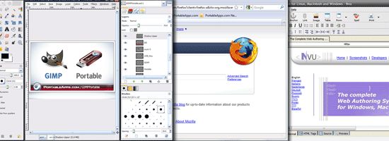
12 Portable Apps for Web Designers

Posted Posted by hacking tips in Comments 0 comments

12 Portable Apps for Web Designers
A web designer must always have his or her tools handy. Of course, that is most often the case when you’re working from home or from an office where you have your own work computer.
But if you are constantly on the move or are doing a lot of demonstrations to your customers at their place of business, you’ll need to carry your programs with you.

jQuery Image Galleries & Sliders – Best Of Read more: jQuery Image Galleries & Sliders – Best Of

Posted Posted by hacking tips in , , Comments 0 comments

jQuery image galleries and sliders are very common on portfolio sites and are also useful for any other type of site for displaying images and photos. Also, provide a good user experience and make viewing images more pleasant and intuitive on your website. With the advent of powerful JavaScript frameworks like jQuery, Prototype, Mootools etc., the quality of JavaScript based image galleries and slideshows have improved dramatically.
jquery 
slideshows jQuery Image Galleries & Sliders   Best Of
Today we’ve prepared for you a good list of the best jQuery image sliders and galleries plugins that can provide you with the resources that you need to get a gallery or a slider on your site.

11 Top CSS Editors – Reviewed

Posted Posted by hacking tips in Comments 0 comments

Back to the time when the look of a website must be defined inside the HTML, web designer experienced the nightmare like coding each tag in every single web page. Thus, CSS (Cascading Style Sheets) comes to bring the salvation to lost web designer. It allows you to define your website’s appearance with just one single external file, which saves a pretty lot of your work and make your code management easier than never before.
css editors
But why do we need CSS Editor? Every glorious revolution has its dark side, as for CSS is every web browser like IE7 does not support the same effect defined by CSS, so often designer has to squeeze their mind to figure out a trick, hack or fix, that’s when CSS Editor comes in to help.
CSS Editor helps you to either understand how certain CSS value works by its WYSIWYG editor, or provide you an inspector to check out what’s exactly the cause for your CSS error, or probably guiding you to decide what CSS property you should use. And in this post, we’re going to review every useful CSS editor that you can get in the web.

FreshBrown Free Wordpress Theme By TricksDaddy

Posted Posted by hacking tips in Comments 0 comments

I was Googling last night so i found this great wordpress theme. Check it and then comment on it.

Screenshot

FreshBrown is a 3 column + 2 column wordpress theme with premium looks. It features a premium look and its best for technology related blogs.


A Collection of “Coming Soon” Web Pages

Posted Posted by hacking tips in , Comments 0 comments

“Coming soon” pages are a great way for websites to engage and connect with visitors, even before the actual site is published.
A well designed “coming soon” page is a great teaser to grab the attention of potential visitors and make them look forward to the website’s launch.
These pages usually include a short sign up form or social media links to notify visitors of updates and the release date.
From minimalist approaches, to elaborate illustrations, there are virtually unlimited ways to create an eye catching design for these website teasers.
In this post, you’ll find a great collection of “coming soon” pages that you can use for inspiration when designing your own.

How to Get a Professional Look With Color

Posted Posted by hacking tips in Comments 0 comments

What makes a design look coordinated, planned and professional? The answer is: ‘color’.
Not every project needs bland corporate blue to look professional. Planning color means creating a framework that describes which colors to use and how to use them.
Color is the slipperiest design element. “Good” color is so closely tied to elusive things like personal taste and intuition, as well as technical considerations such as contrast and monitor calibration.
But color is vital to content. If you consider a website important enough to spend time refining, then readers will likely consider it important enough to spend time reading. Good color choices make that happen.
In this article we’ll review some techniques to achieve beautiful color palletes for your web designs.

different hues can conflict, but different values of one hue work
The best way to make a website look unplanned is to choose its colors at random.
Even when visitors skim a website’s home page for the first time, the colors influence their attitude towards the content. Is this website exciting? Reassuring? Daring? Bland? Political? Formal?
Color affects how people interpret what they see as much as typography.

The Principle of Proximity in Web Design

Posted Posted by hacking tips in , Comments 0 comments

Recently I picked up an old design book that I hadn’t touched in a while, and it reminded me of a design principle that many of us put into practice probably only subconsciously, if at all.
The book deals with designing for print, but I thought it would make a great topic to discuss in the context of web design.
The principle of proximity calls for related items to be grouped visually, creating less clutter and making for a more organized layout. Items unrelated to each other should be placed further apart, to emphasize their lack of relationship.
I’ll discuss details and some ways in which this can be implemented effectively, but this definition should suffice for what we’ll discuss in this article.
The correct use of proximity, in conjunction with other design principles, has a big impact on the user experience and, ultimately, a website’s overall success.

Don’t Fear White Space

The first step to properly implementing the principle of proximity is understanding the importance of white space in design.
Lack of white space is a common problem in amateur designs. Design is a means of communicating information, and when amateurs attempt to convey a message through design, their natural inclination is to spread out the content evenly to fill the space, without giving much thought to the potential of well-organized white space.
White space can affect the user’s behavior as much, if not more, than the actual content on the page. White space guides the user’s eyes in the intended direction, creates contrast and makes a lasting impression.
W3Avenue
Even though W3Avenue’s website above contains a considerable amount of content (with articles under numerous categories, like any design blog) and a series of sidebar ads, it doesn’t overwhelm the user visually.
The generous room in the header and appropriately spaced items in the content and sidebar areas contribute to this clean and organized look. W3Avenue is not doing anything particularly unique with its content, but its design probably contributes to the strong traffic it gets in a short period of time.
So don’t be insecure about empty space in your design. Properly using white space is the first step in implementing the principle of proximity and, thus, making a design more visually appealing.


20 Tips on How to Write for the Web

Posted Posted by hacking tips in , Comments 0 comments

There are really only a few tricks to writing properly for the web. If you know how to write, you are already 95% of the way there.
These are some of the more common mistakes that I’ve seen in web copy and some tricks that I use every day to write effectively, from e-mails to site pages.
You don’t need to be an English major to understand any of this advice either. It is written in plain English that everyone can understand.
These are tips based on my own experience and education as a writer, and particularly as a writer specializing in the web.

If you’ve got some tips of your own feel free to share them in the comments section. 

1. It’s Versus Its
This is a very common mistake that a lot of people make.
It’s is short for “it is”, so “it’s all relative” is correct while “it’s color is blue” is not. “Its” is a term of possession, so “its color is blue” is correct.

2. Overuse Of Punctuation

Excess punctuation should be left out of most sentences on the web. If a reader sees a sentence with more than one comma, the sentence becomes harder to scan and therefore more likely to turn a reader off.
More advanced punctuation such as semi-colons and colons should be avoided completely by starting new sentences instead.

How to Build a Footer That Doesn’t Stink

Posted Posted by hacking tips in , Comments 0 comments

As the first thing visitors see, home pages and headers often steal the design spotlight.
But above-the-fold thinking neglects the natural flow of vertical page layout. What happens when people reach the end of a page?
You can bet that a simple copyright statement won’t hold visitors’ attention, but many pages are designed with the expectation that people will find their way… or so we assume.
The bottom of a page is not the end of a website. An informative, compelling footer is the natural place to lead people to more information within the site rather than wandering aimlessly.
Read more about the trends and innovations that follow page content and answer the unspoken question, where to from here?
The ongoing problem of how to hold people’s attention can be addressed in many ways: eye-popping graphics, clever use of negative space, snappy typography and well-written text.
But all too often people are left hanging when they scroll to the bottom of the page. Should they scroll back up? Visit another website? Close the tab?
Where the body content ends, the footer takes over.